Make a SF symbol look better

Sometimes I learn useful things and use these useful things just once and immediately forget them afterwards. The next time I have to start from scratch again. Unless I write a blogpost about it, so consider this of these blogposts, it's about combining different UIImage.SymbolConfiguration (Documentation) using UIImage.Configuration.applying (Documentation).
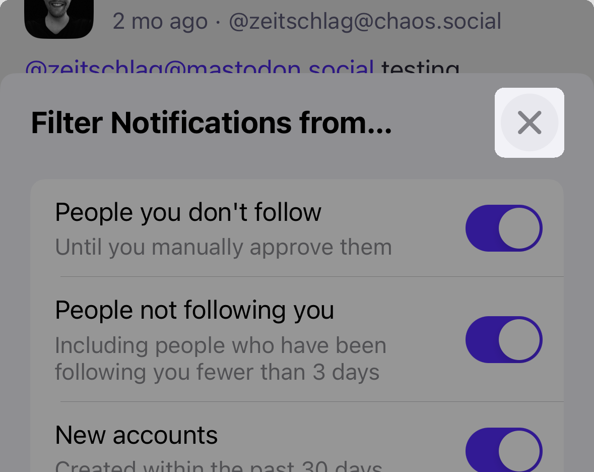
My last feature for Mastodon for iOS was Notifications Filtering. Sam, the designer, wanted me to make the header of the "Filter Notifications from..."-sheet look similar to the one in the Notes-app you can use to format text. The interesting part here is this Close-button:
The plan was to use a standard UIButton with an xmark.circle.fill-SF Symbols-symbol and several UIImage.Configuration for color and size. I remembered that multiple of them can be combined, but not how. It works like this using the applying-method:
let colorConfiguration = UIImage.SymbolConfiguration(
    paletteColors: [.secondaryLabel, .quaternarySystemFill]
)
let sizeConfiguration = UIImage.SymbolConfiguration(scale: .large)
let imageConfiguration = sizeConfiguration.applying(colorConfiguration)

let buttonImage = UIImage(
    systemName: "xmark.circle.fill",
    withConfiguration: imageConfiguration
)

// TODO: do something with buttonImage. Use it in a button, for example.
The interesting part here is sizeConfiguration.applying(colorConfiguration). It applies colorConfiguration to sizeConfiguration and returns the updated configuration. This also means that you can use applying more than once:
let imageConfiguration = sizeConfiguration
    .applying(weightConfiguration)
    .applying(colorConfiguration)
Now I will never ever forget again how to make SF Symbols look great. Well, okay, at least now I know where to look. 👋